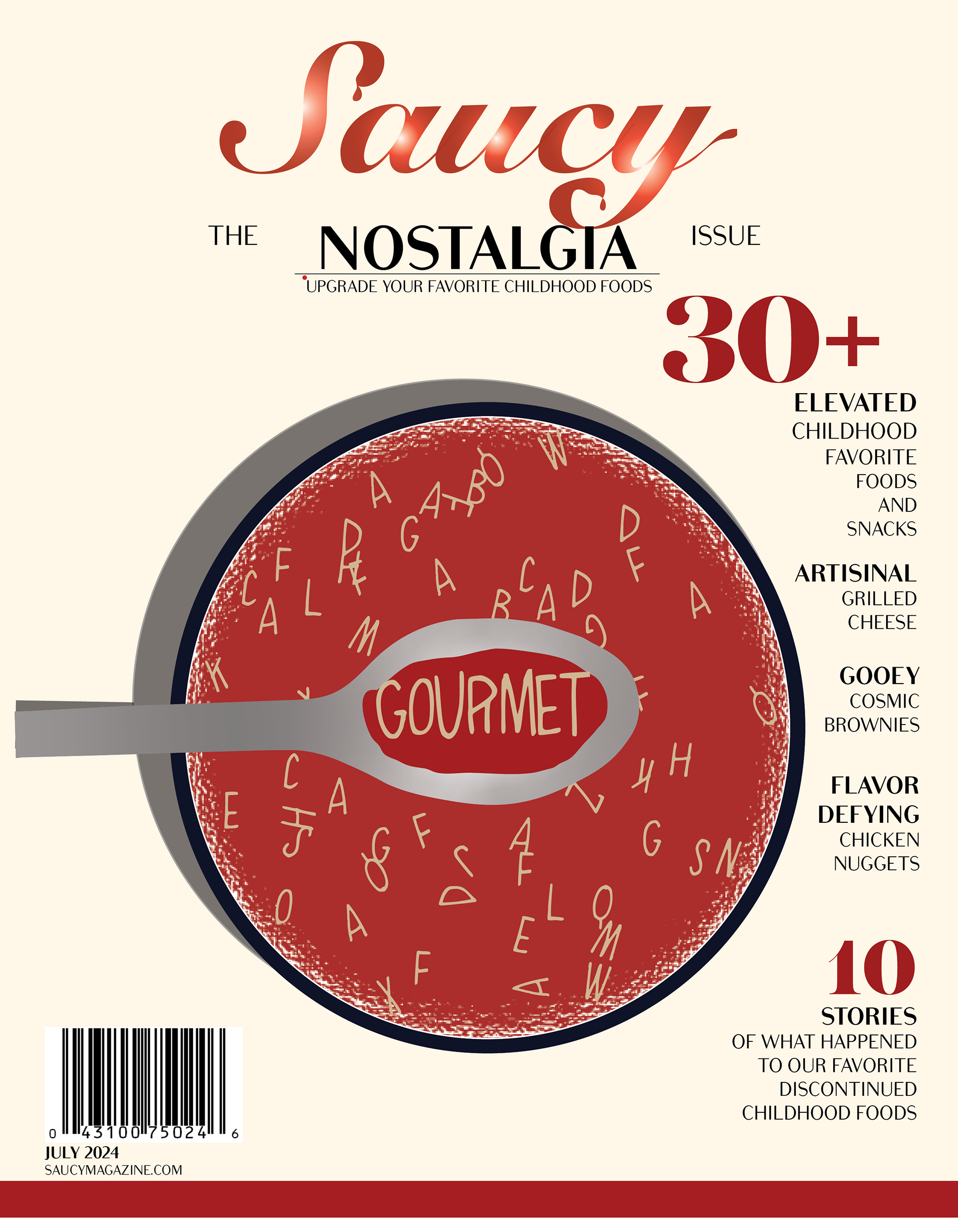
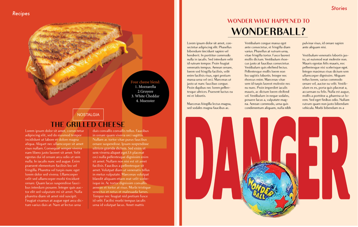
For my food magazine mock-up, Saucy, I wanted to create an issue that captured the essence of nostalgia with a playful and original approach. Aimed at young adults ages 20-35, particularly those who grew up in the late 90s and early 2000s, the issue focused on elevating childhood favorites and exploring the stories behind discontinued food items. The magazine’s lighthearted tone and bold design were meant to evoke a sense of nostalgia, offering a fun and reflective look at how food trends have evolved. A graphic of Campbell’s alphabet soup spelling out the word "gourmet" further emphasized the theme, blending childhood memories with a touch of sophistication.
The design of the magazine was carefully crafted to balance youthful energy with a more mature, adult aesthetic. I chose a bold red color for the cover and spread to symbolize excitement and danger, which complemented the playful theme while maintaining a sophisticated look. To maintain an adult vibe, I paired this with neutral tones and subtle yellow/orange accents. The font choice, Bodoni Sans, added an elegant touch without the heaviness of a traditional serif, aligning with the magazine's refined yet nostalgic feel. Throughout the layout, I played with weight and emphasis to create contrast—such as focusing on the right side of the cover and minimizing text on the first page to create a clean, impactful design. The repetition of font, colors, and overall layout created a cohesive experience that pulled the reader through a visually engaging journey from start to finish.