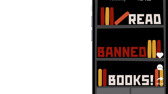
In a visual design course, I created a poster featuring three columns, each representing a pair of visual antonyms. The goal was to explore how typography, color, texture, and form could be used to personify meaning and convey contrast in a purely visual way.
The layout features three columns, each dedicated to a pair of opposing concepts: Freeze vs. Melt, Organic vs. Synthetic, and Soft vs. Hard. The goal was to visually communicate the essence of each word without relying on definition—only on design. For Freeze, I used an all-caps font styled to look like solid ice, featuring a pale blue tint and frosted edges to evoke a cold, rigid feel. In contrast, Melt is lowercase, with the same icy texture but heavily distorted to appear as though it’s dripping. Organic was designed using leafy, bush-like forms to spell out the word, resembling natural growth and texture, while Synthetic has a sleek, metallic look—similar to chrome or plastic wrap—highlighting its artificial nature. Lastly, Soft appears in lowercase, a pink hue, and a plush, fluffy texture reminiscent of a stuffed toy, while Hard is rendered in bold, all-caps with a red brick texture, giving it a grounded, rigid feel. This project deepened my understanding of visual language, showing how design can speak on its own.